Behind the Scenes: Macon heights - Headlights
I first came across Macon Heights when they were performing in a previous band called Scare Noire. They have a wonderful EDM sound which is performed live and Carrie is well known for her elaborate make up and wardrobe.
Dance and Electronica can often struggle with providing a meaningful visual to support the live act, but Macon Heights have this in droves. They approached me to do a video for their new single. We started off with a Zoom chat to catch up and then they sent me some ideas and concepts.
They had a really cool logo already(Designed by Gregor Fergie):

I decided that the sound would really suit using the geometric shapes as negative space. The triangles would never quite let you see a full frame, which I thought complimented the shapes that Carrie was throwing. From there it was just really a case of finding a space for filming all the content to fill the spaces with.
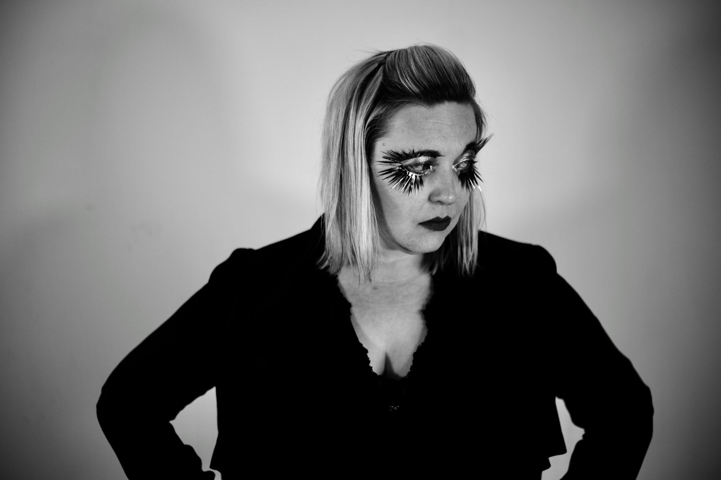
The band had a great history of hair and make-up for aesthetic. Both of them had makeup which was verging on wardrobe. This was done by Erin Culley
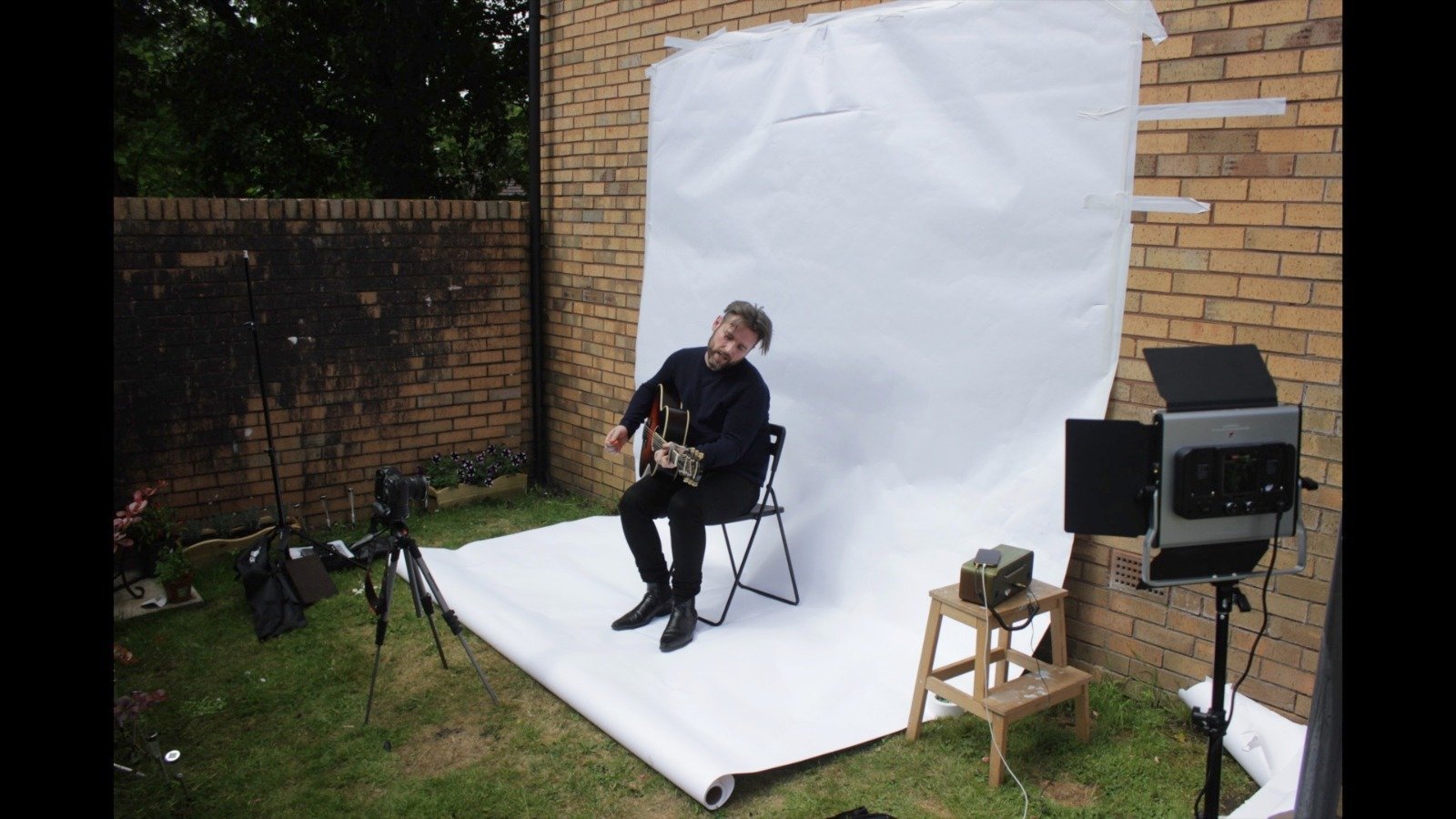
The band booked Bleach Studios in Edinburgh which gave us big white infinity walls to play with:

Previously I’d built one for the John Rush Sister Video outside for covid and space reasons, but Bleach Studios had something more professional.
From there it was just a case of running the band through miming along to the track from different angles and in different compositions. These could then be chopped and edited to be presented within the abstract shapes of the logo.

With strong source content, and a minimalist idea, there are so many different directions to go in. I couldn't resist taking some studio photos of the band in such a nice setting.


From there it was all post processing in Final Cut Pro to make best use of the source material. This then went back and forth with band to make sure it was what they were looking for. It’s amazing that the sterile white space of the studio is the source material for something dark and colourful.
This video was definitely all in the edit. It’s an intriguing plan to close off so much of the screen, but it made for a really interesting aesthetic where the image is partially obscured and you can never quite see things. I’m not quite sure if I can suggest this is a nod to burlesque or the titles from Lloyd Grossman’s Through the keyhole.
The hardest part was deciding how busy to make the edit. There’s so many cool things you can do with the concept, but some of the best parts are the simplest. In trying to achieve a “less is more” feel, I only moved one thing at t a time, sometimes it was the abstract space, sometimes it was the background, sometimes it was the subject.


